record cover
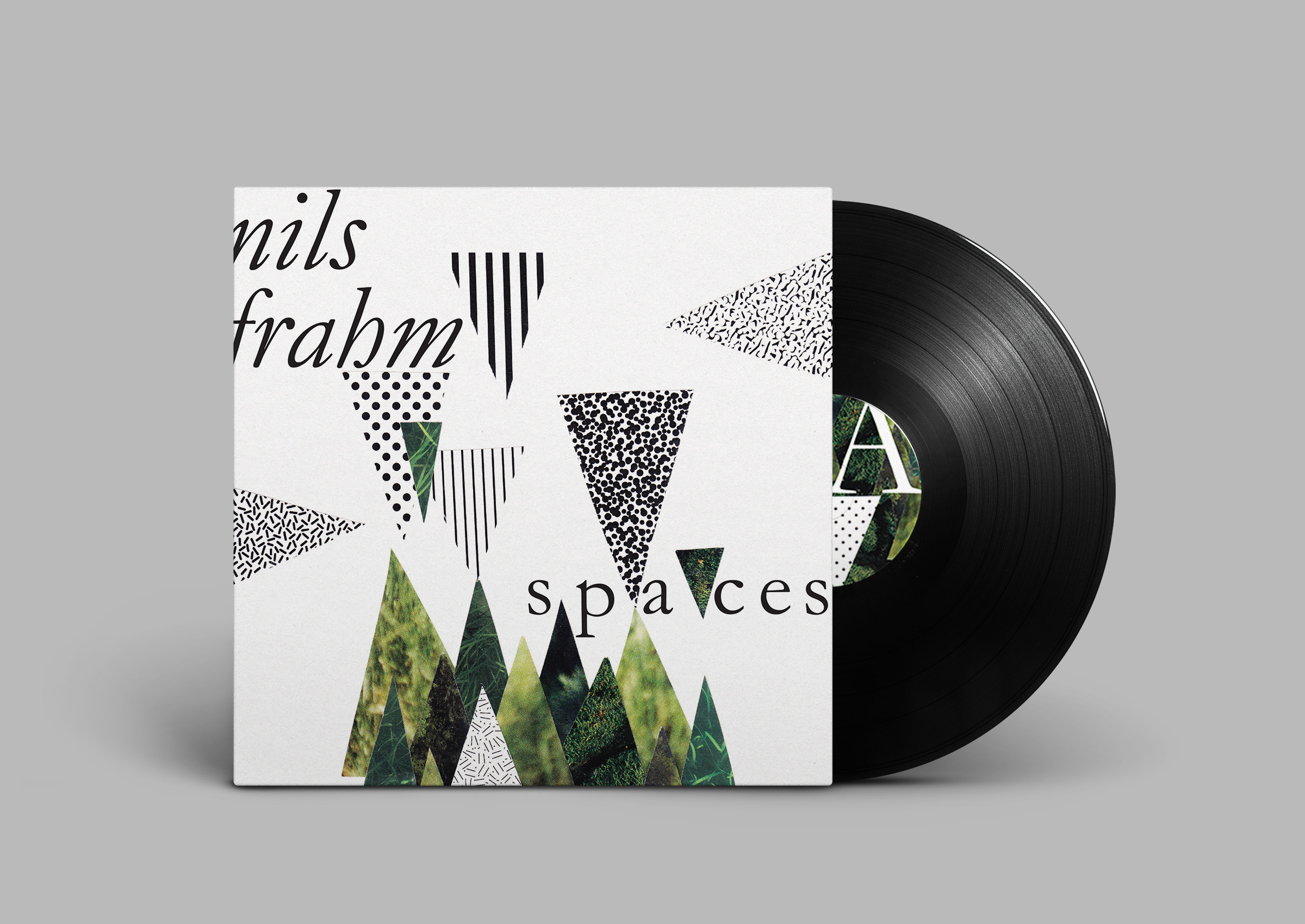
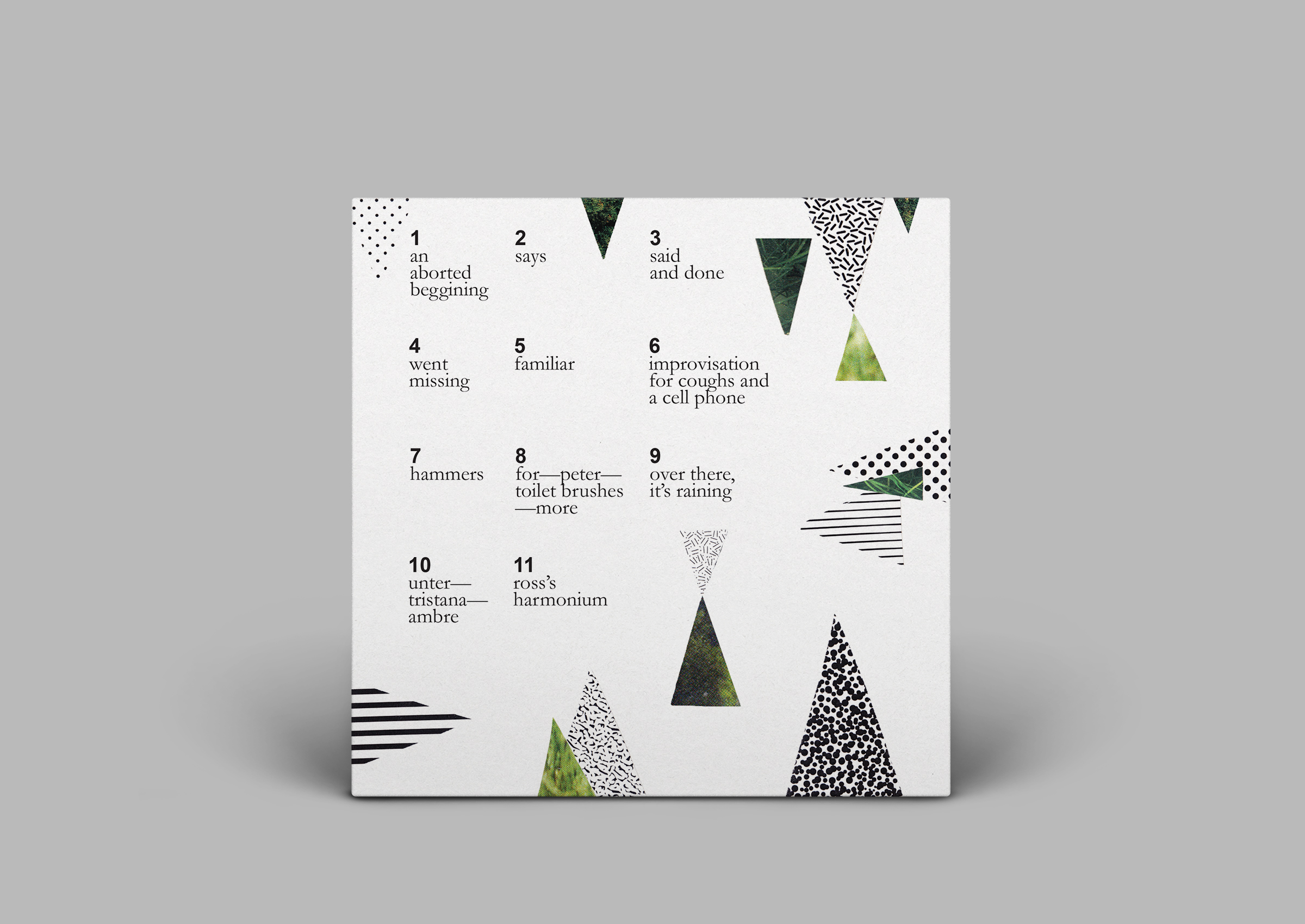
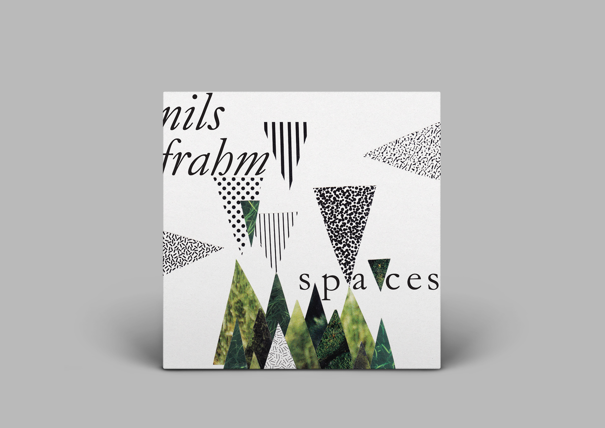
My take on a cover and label design for Nils Frahm's album, Spaces.
Inspiration:
Whenever I listen to music, I often find myself envisioning something while it is playing—a video idea, a dance, or even a scene in nature.
The soft and serene melodies in Spaces inspired me to envision a composition that resonates with nature, but has a modern twist.
I hacked up some old National Geographic magazines and printed B&W patterns to compose several collages (sorry Nat Geo). After scanning them, there was a lot of back and forth between Photoshop and Illustrator. Annnd voila!


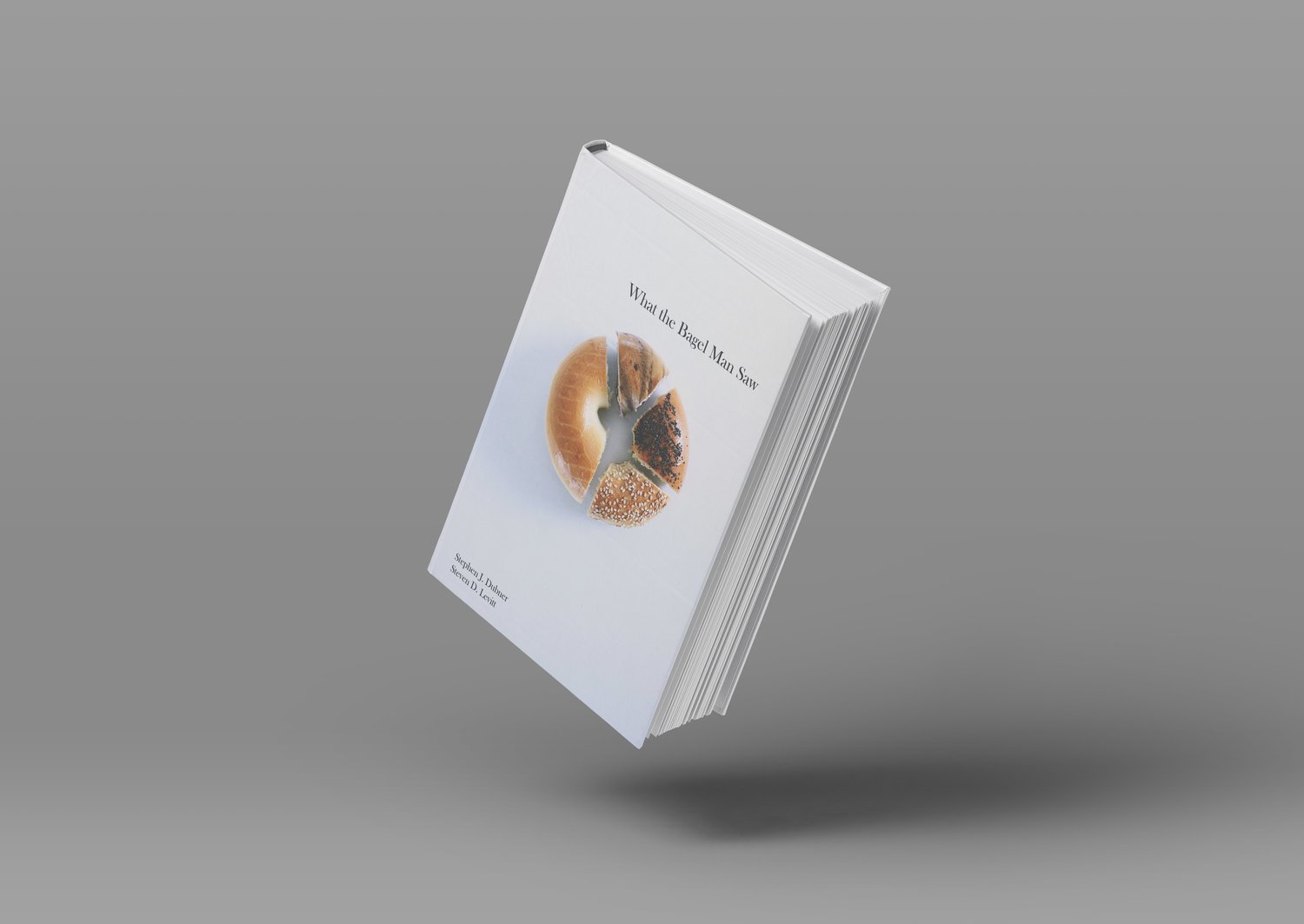
BOOK COVER
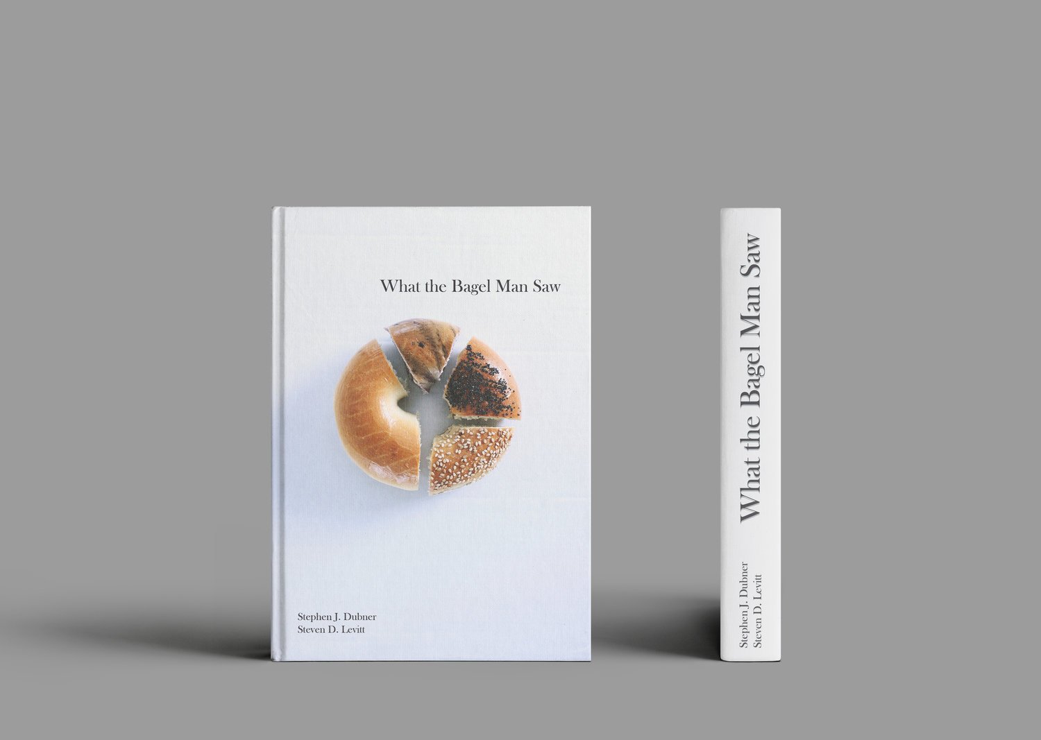
What the Bagel Man Saw is a story about economics and bagels with a philosophical undertone of human nature.
Inspiration:
"Bagel pie chart" and hunger immediately came to mind while brainstorming ideas for this book cover. So here's what I did next...
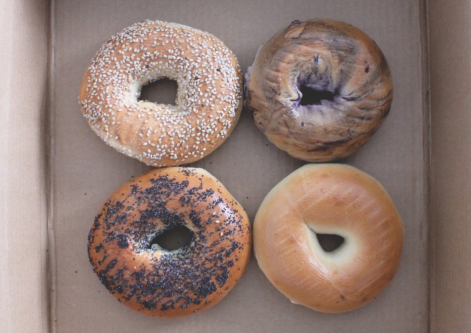
Go to store and pick out the fanciest bagels
Go home, slice and dice bagels to my liking, and take their photos
Consume slain bagels and work some Photoshop magic

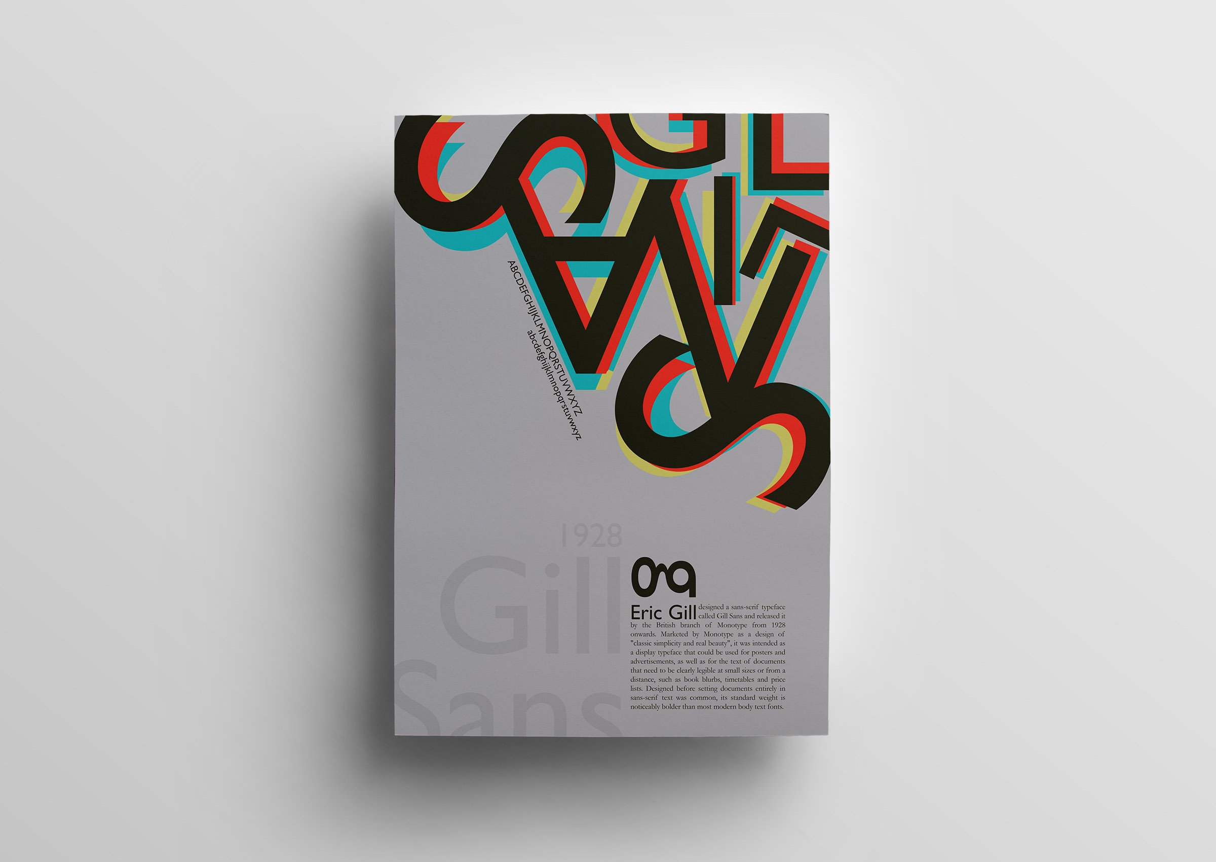
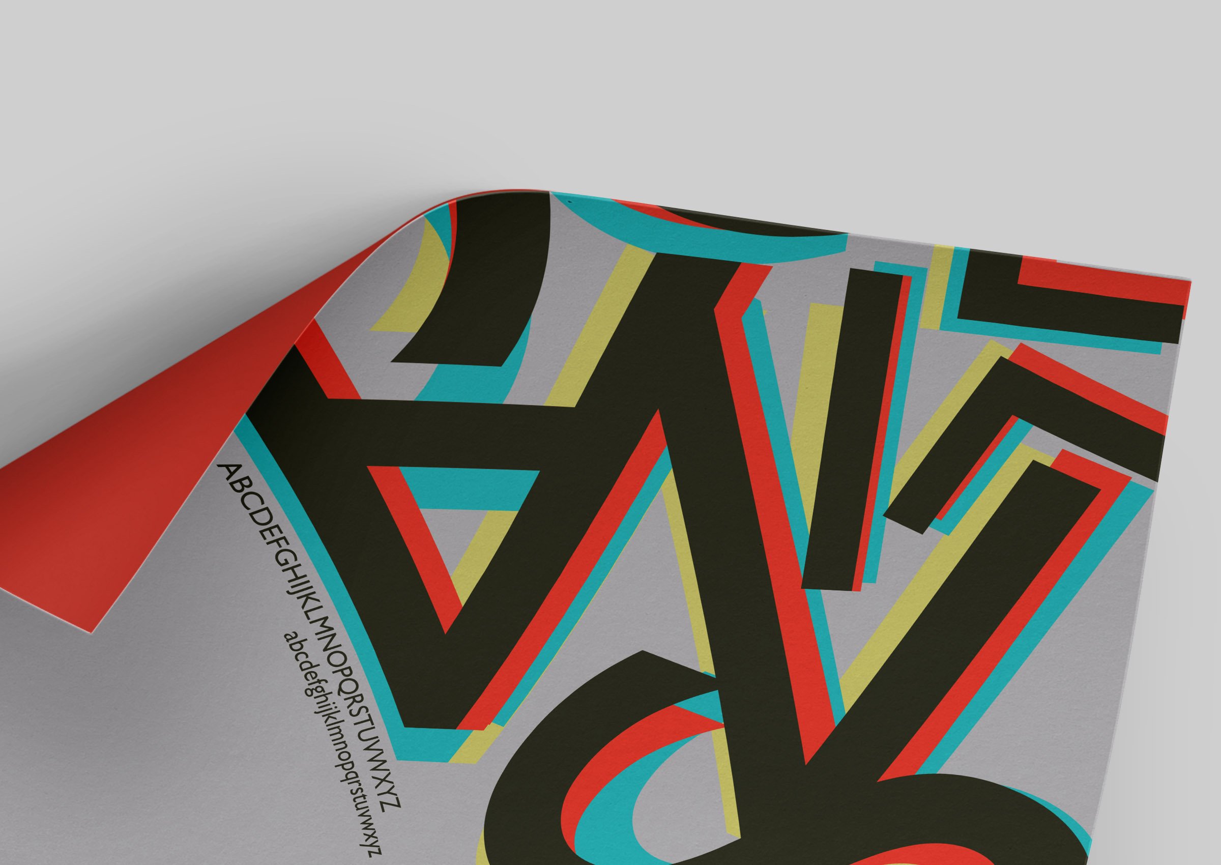
TYPOGRAPHIC POSTER
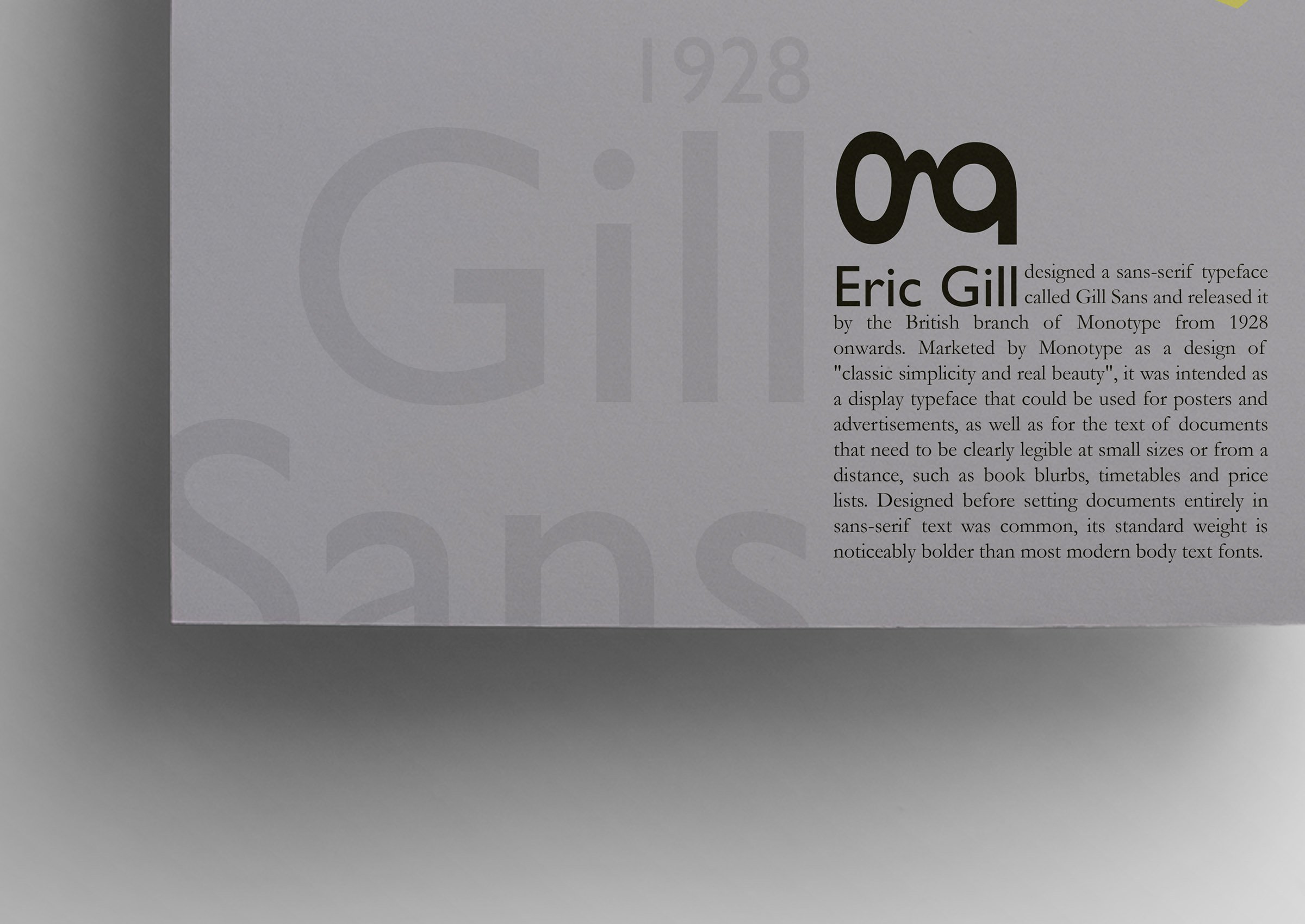
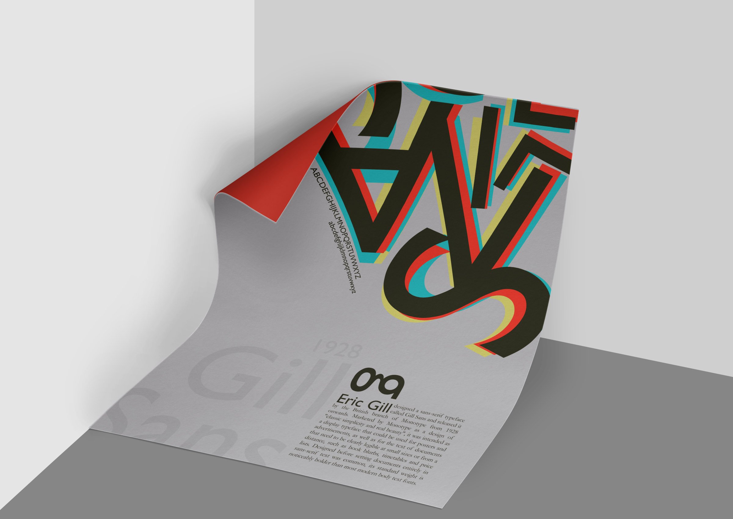
Just a typographic poster showcasing one of the most iconic fonts of all time, Gill Sans.
Inspiration:
Sorry Helvetica, but I chose good ol' Gill Sans for this one.
Did you know the lowercase g resembles Gill's glasses? How cool is that!? In typography, stuff like that wins me over.
The essence of Swiss style is something I am greatly inspired by and try to include in my work as much as deemed appropriate. Swiss style + iconic typeface = magic.